Goal-Focused BPMN Modelling: Turn Diagrams into Results
Thursday, August 21, 2025
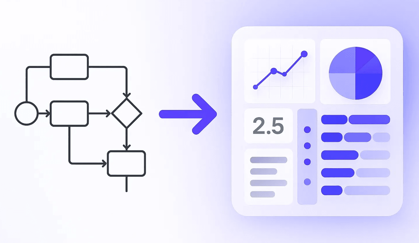
Most BPMN diagrams are technically spotless yet strategically blind. They show every task and decision but never reveal why anyone should care. Goal-focused modelling fixes that by tying each path in the diagram to a concrete business outcome. When you model this way, a process map stops being documentation and starts acting like a mini-dashboard for your strategy.
Why “Technically Correct” Isn’t Enough
A perfectly valid BPMN model can still fail its audience if it can’t answer questions such as: Which branch drives revenue? Where do we lose high-value customers? What really happens when the “unhappy path” fires? Until a diagram makes those answers explicit, it remains little more than nicely formatted plumbing.
Designing with intent
Goal-focused modelling begins with a simple conversation: What result should this process achieve? Once that purpose is clear, you rename every end event to reflect the outcome it delivers — “Qualified: Routed to Sales,” “Customer Retained,” “Loan Declined with Feedback.” Gateways are no longer neutral diamonds; they become decision points tied to concrete KPIs. A split that checks Lead Score ≥ 70 now speaks the language of Sales-Qualified Leads. Even intermediate events can carry narrative weight by marking milestones such as Contract Signed or Risk Review Completed. Finally, lane placement turns accountability into a visual cue. Whoever owns the outcome owns the lane — and the work that lives there.
A quick before-and-after
Picture the classic lead-qualification flow:
Lead Generated → Capture Info → Score Lead → Route to Sales / Nurture → Lead Processed
It’s tidy, but directionless. Re-imagined through a goal-focused lens, the same flow reads:
Lead Generated → Capture Info → Score Lead →
- Score ≥ 70 → Qualified — Routed to Sales
- Score < 70 → Unqualified — Added to Nurture Track
In less than a dozen words you’ve surfaced two explicit outcomes and anchored the gateway to the metric that matters. The diagram is now an at-a-glance story about revenue, not a silent list of activities.
A real-world detour: the loan saga
A regional bank recently mapped its mortgage process. The model showed six swim-lanes, nineteen tasks, and three approval loops. What it didn’t show was why 30 percent of applicants abandoned the journey. By renaming its final events to Approved, Rejected — High Risk, and Withdrawn — Timeout, analysts could finally quantify the cost of that last branch. Within a month, the bank introduced an SMS reminder between appraisal and offer, trimming withdrawals by nearly half. The diagram didn’t merely document change; it exposed where change was worth making.
From picture to dashboard
Once every path ends in a clear result, stakeholders can interrogate the model the way they’d interrogate a report. Gateways turn into on-canvas analytics; end events become categories on your scorecard; lanes highlight who is on the hook if those numbers slip. You no longer need a separate deck to see whether a process works — its logic and its impact share the same page.
Keeping outcome front and center
If you ever feel your model drifting back toward shapely but meaningless flow, reach for a simple test: replace every generic end event with the sentence, “We care because …”. If you can’t finish the sentence, you haven’t found the outcome. When you can, the value becomes unmistakable.
Wrapping up
A clean BPMN diagram tells you what happens. A goal-focused diagram tells you why it matters. The distinction may feel small while you’re drawing, but it’s massive when the process goes live. Spend the extra minute weaving purpose into your flows and you’ll spend far fewer hours untangling them later.
Next week I’ll tackle one of the biggest culprits of diagram clutter — free-floating events and activities — and show you how to anchor them without losing clarity. Stay tuned, and happy modelling!